

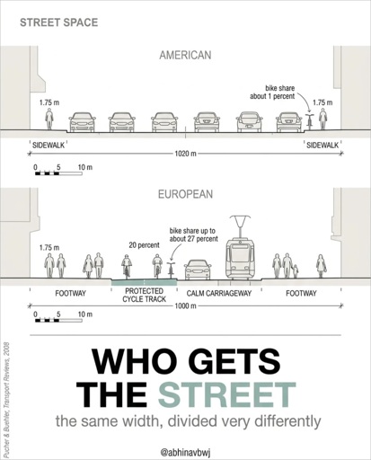
Architect and urban & computational designer Abhinav Bhardwaj made this great set of slides comparing urban design in the US and Europe, peppered with pithy observations like:
- European space is shaped on purpose: American open space is what’s left over.
- Small blocks make more corners, more routes, more street life.
- A fine grid offers hundreds of routes; the tree offers one way out.
If you take the 10 m scale below as a measure, the person would be 5 m tall and the 100(0) m would be ~50-60 m.
Yeah at a bare minimum the numbers in this drawing are all completely totally wrong. Is this an AI drawing?
As the cited paper is from 2008, I was tempted to say no. However, only the relative shares of the modes of transport are from the article, not the graphic itself.
So yes, this is likely an AI generated graphic.
https://www.researchgate.net/publication/292752103_Making_cycling_irresistible_Lessons_from_europe
Fuckin hell.
One cited paper is from 1889, predating this whole graphics style by about a century. The graphics are probably what an AI made as a response to “illustrate this text passage” or “redraw this figure as vectors”. (Yes, this one probably generates vectors, otherwise the font families would be inconsistent within images, not just between them)
What person would label a human as “1.75 m”? We know what a “human for scale” is. Also, every single graphic, despite credited to the same author, uses a different scale marking: zebra, bar, tick, snaking (and then ignores it). The fonts differ too (look at every capital R) but oddly not within drawings, it seems to be an AI optimized for vector output.