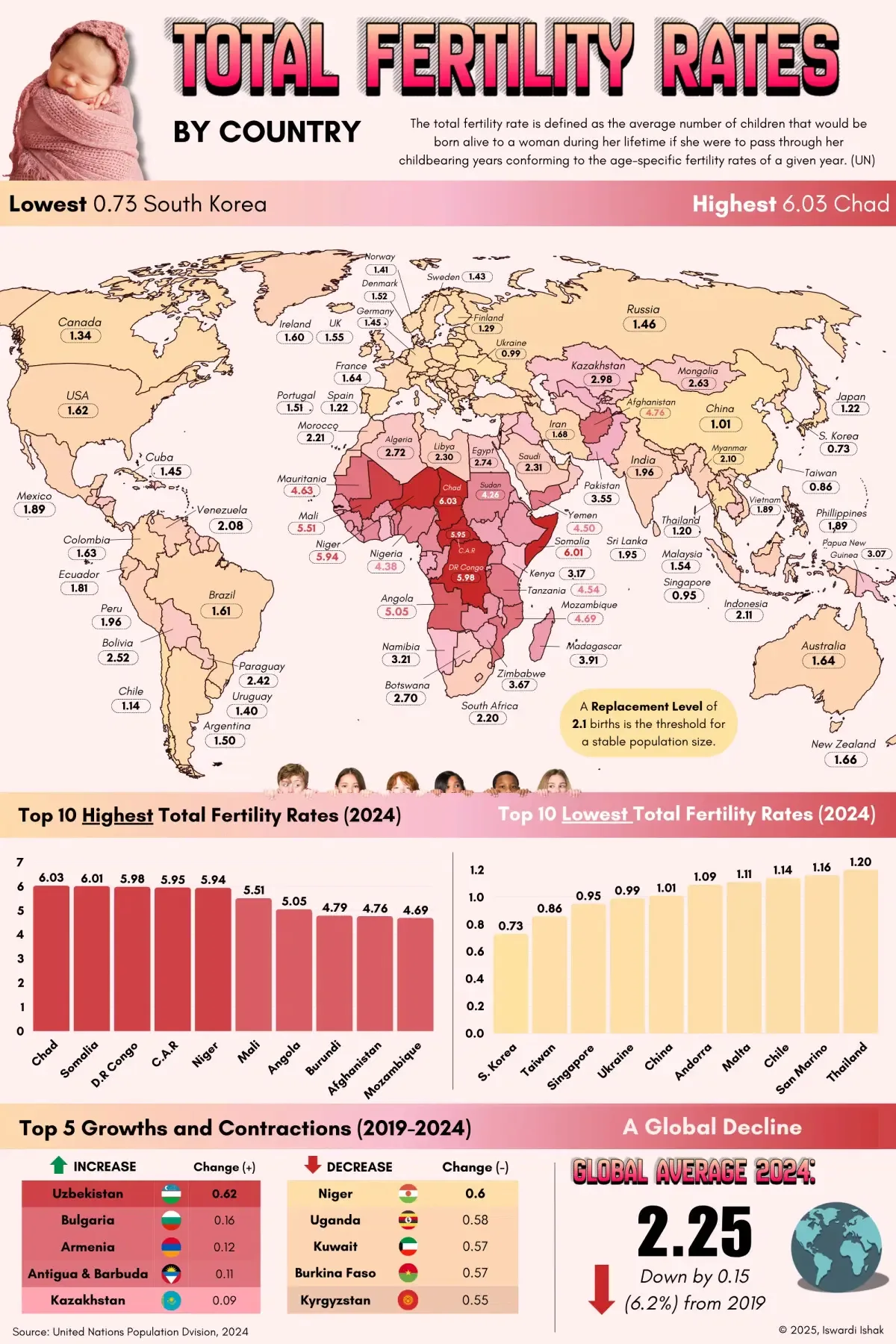
The migration map would be more useful if it showed “flows” – i.e. inflow to country vs outflow, then cross-correlated against birth-rates over time. Also, whether the migrants are temporary workers vs. permanent residents and citizens. Temporary workers usually don’t set down roots and assimilate.
That way you could see which countries are heading toward population collapse.

Would be nice to have emigration/immigration data in the side.
https://lemmy.world/post/41069218
The migration map would be more useful if it showed “flows” – i.e. inflow to country vs outflow, then cross-correlated against birth-rates over time. Also, whether the migrants are temporary workers vs. permanent residents and citizens. Temporary workers usually don’t set down roots and assimilate.
That way you could see which countries are heading toward population collapse.
Just looked at the linked migrants post and USA and Germany are in the top, but still has quite low birth rates.
Yes. This is where China is very different. Not only low birth rates but also people leaving/low immigration.